THE HRL JOURNAL · COLOR & DESIGN
Out here, color never starts on a paint chip. It starts with the land — warm saddle leather, a denim sky going soft at dusk, sandstone and sage and sun-bleached bone. The most beautiful ranch homes simply bring that palette indoors.
The trouble is that getting it right is harder than it looks. Western color leans warm and earthy, and one cold undertone in the wrong place can throw an entire room. That’s why a designer rarely chooses colors one room at a time — they build a whole-home palette, a small, deliberate family of shades that flows from the entry to the bedrooms and ties the house together.
Below are five western color palettes we return to again and again, each drawn from a different corner of the western landscape. Think of it as a field guide: the mood of each scheme, where it works best in a home, and the kind of house — and homeowner — it was made for.
What Makes a Color Palette “Western”?
A western palette is warm-forward and grounded in nature. The neutrals carry a hint of clay, leather, or stone rather than gray; the accents come from things you’d actually see on a ranch — turquoise, rust, indigo, gold, oxblood. Nothing feels sterile, and nothing feels loud for its own sake.
The discipline is in the restraint. A good scheme runs on a simple rhythm: a dominant neutral across most of the walls, a secondary tone carried through trim and built-ins, and one or two accents that show up in a study, a kitchen island, or a powder room. That structure is what makes a barndominium’s wide-open volumes feel intentional instead of cavernous — and what gives a farmhouse its collected, lived-in calm.
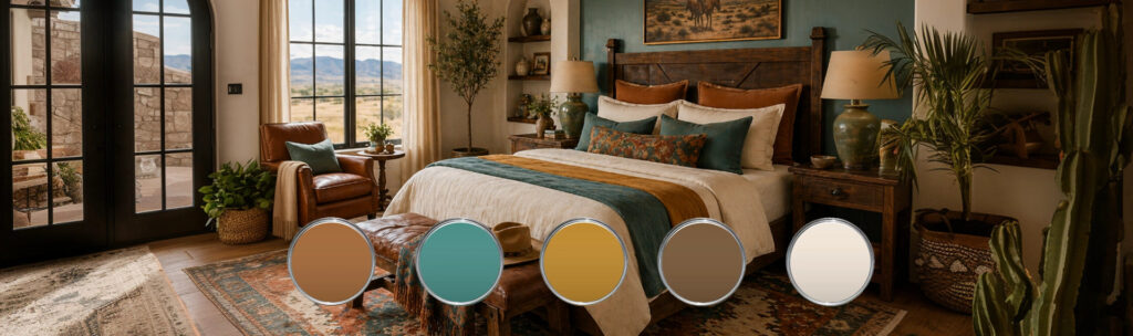
1. Saddle & Sky — The Blue-and-Brown Classic
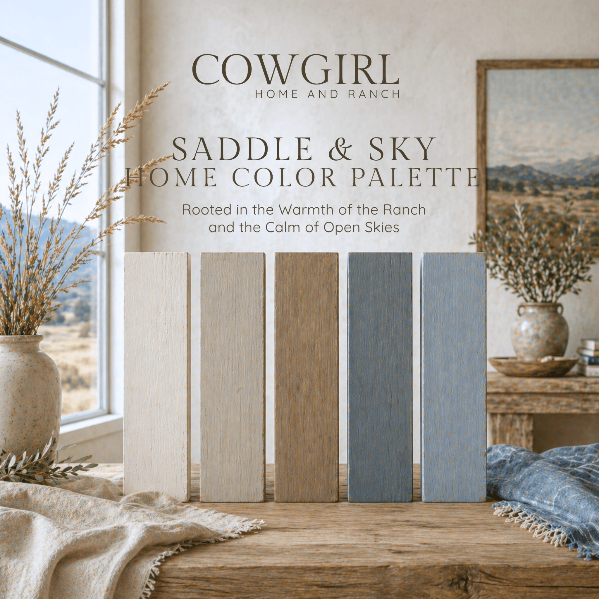
If you only ever try one western scheme, make it this one. Saddle & Sky is the blue-and-brown color palette in its most timeless form: the warm brown of worn tack against the soft, faded blue of a morning sky. It’s the most livable and forgiving of the five — the browns keep it grounded, the blues keep it from feeling heavy, and the two balance each other in nearly any light.
It belongs in the rooms you live in most: open great rooms, primary bedrooms, and the long sightlines of a barndominium where one palette has to carry the whole floor. The feeling is steady and unhurried — classic ranch, never costume western.
See the Saddle & Sky Home Color Palette →
2. Desert Bloom Ranch — Warm Terracotta & Clay
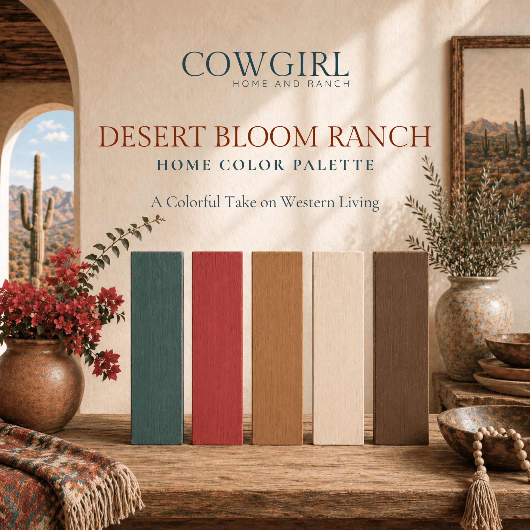
Desert Bloom Ranch is sun on adobe. Built around terracotta, clay, and soft desert neutrals, this terracotta color palette feels warm the moment you walk in — romantic and rustic at once, with the kind of glow that makes a room feel inhabited even when it’s empty.
It’s made for the spaces that catch the most light: kitchens, sunrooms, breakfast nooks, and homes that lean southwestern. Pair it with natural wood and a little wrought iron and it reads effortless. This is the palette for the homeowner who wants warmth and softness over high contrast.
See the Desert Bloom Ranch Home Color Palette →
3. Turquoise Terrace — Spirited Southwestern Jewel Tones
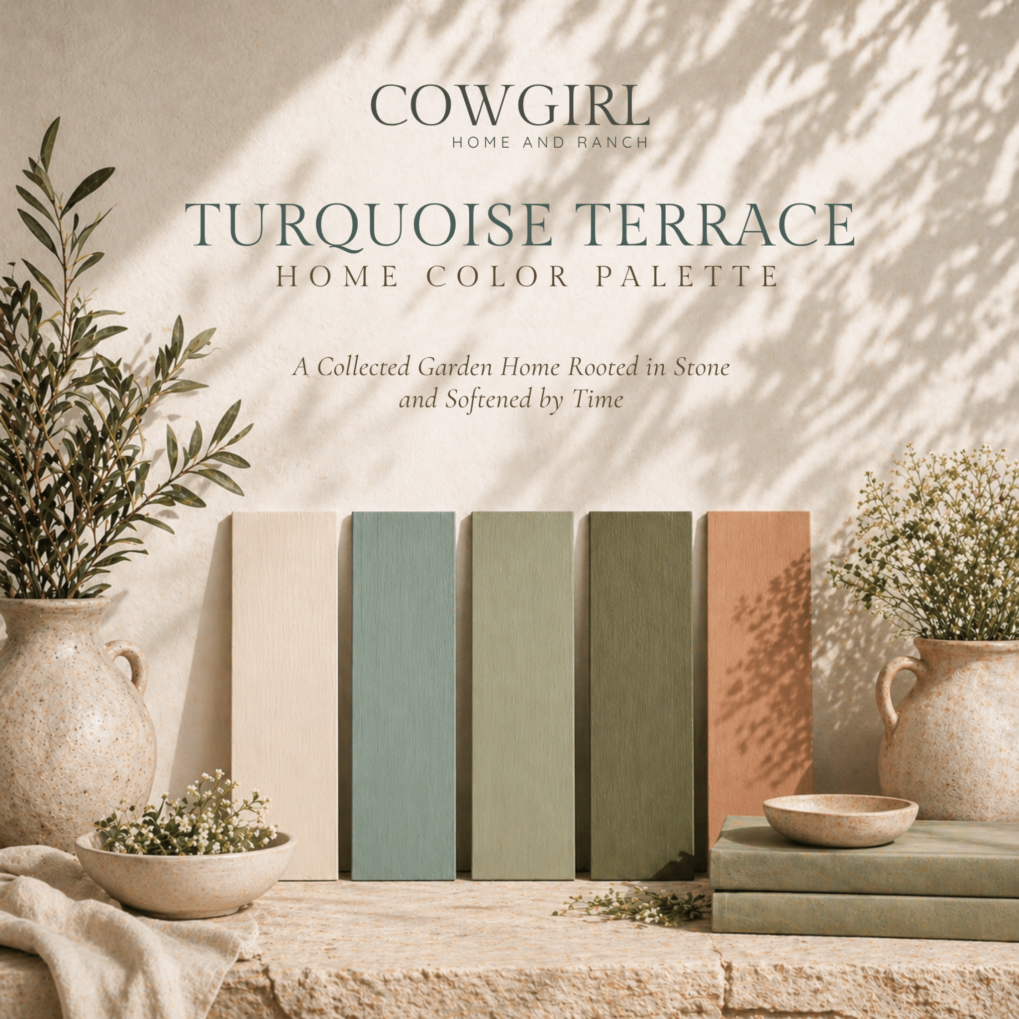
For the homeowner who isn’t afraid of color, Turquoise Terrace is the most spirited of the five. Anchored by true southwestern turquoise and balanced against grounded earth tones, it has a little glamour to it — the kind of scheme that turns an entry, a powder room, or a statement kitchen into the most photographed corner of the house.
It’s best used with intention: let it own a few key spaces rather than the whole home, and keep the surrounding rooms quiet so the turquoise stays the jewel. Energetic, collected, and unmistakably western.
See the Turquoise Terrace Home Color Palette →
4. Amber Horizon — Golden Hour, All Day
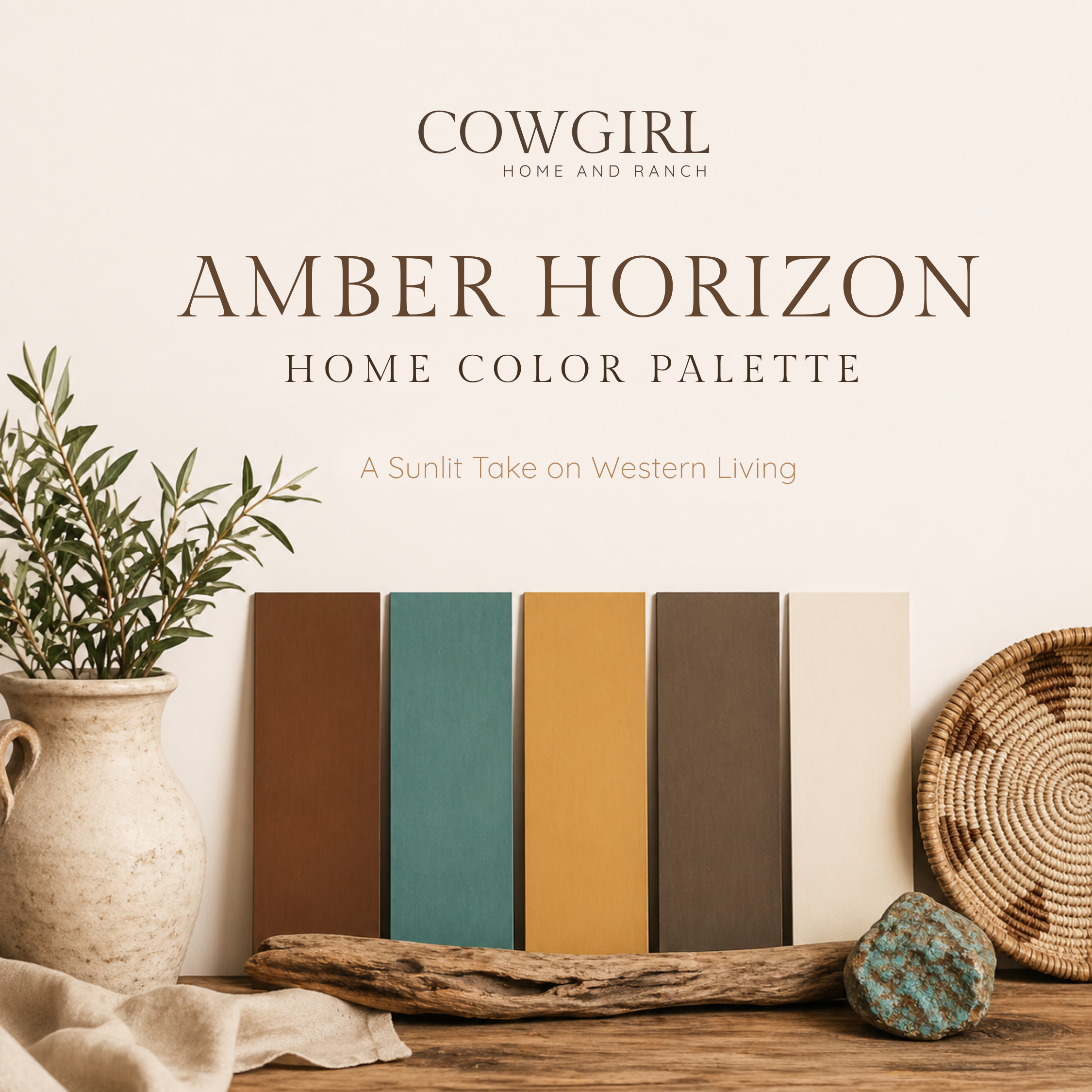
Amber Horizon bottles the last hour of light. Honey, amber, and warm gold neutrals give this palette a serene, enveloping quality — it’s the gentlest of the five, with very little contrast and a great deal of warmth.
Use it as a whole-home base, especially in houses blessed with good natural light, where the golden tones deepen through the day. It flatters wood, brass, and cream, and it’s the natural choice for the homeowner who wants a home that feels calm, soft, and quietly luxurious from room to room.
See the Amber Horizon Home Color Palette →
5. Crimson Ranch — Rustic Red with Backbone
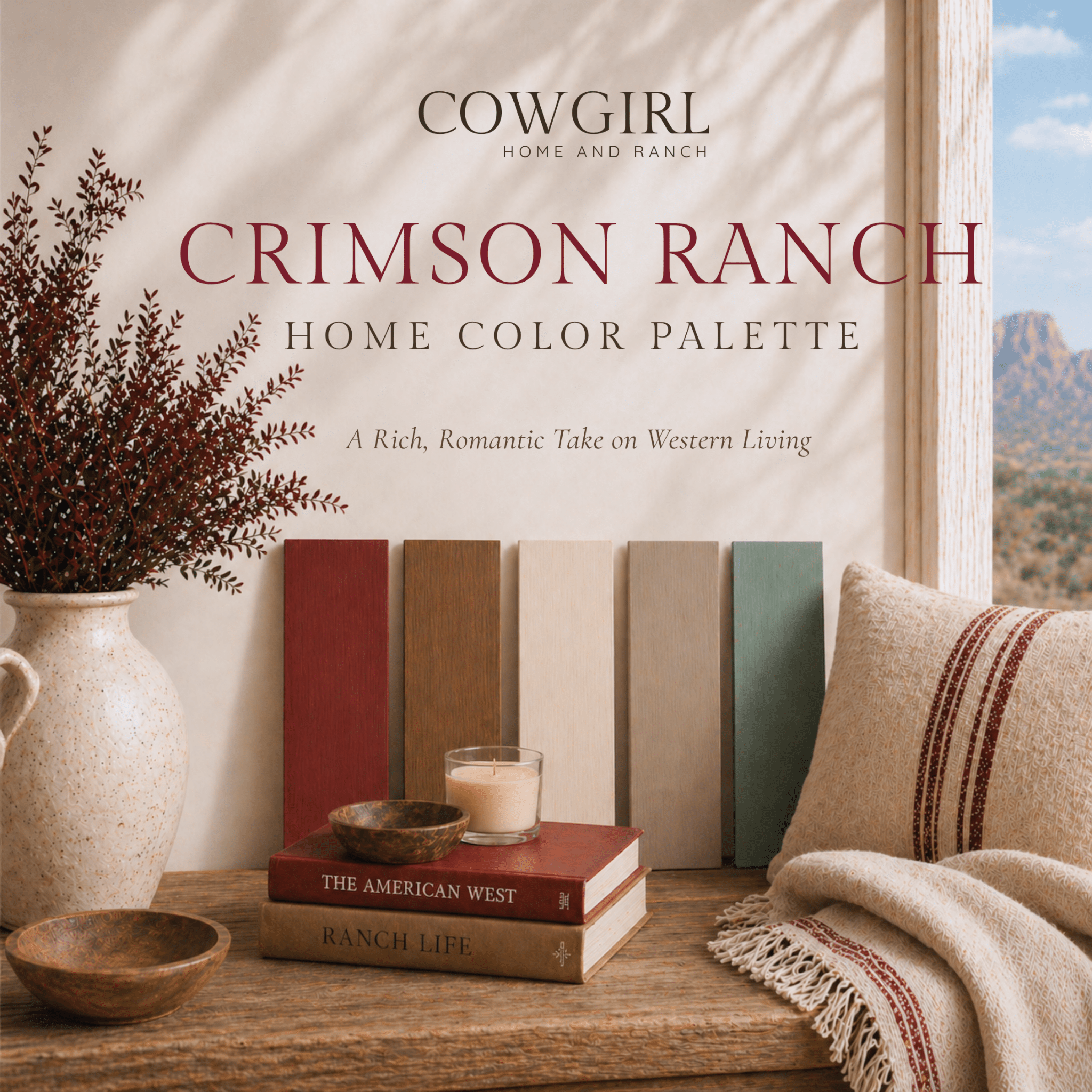
Crimson Ranch is the boldest, most heritage-minded of the group — a rustic red palette in the tradition of the barn itself. Think oxblood, brick, and deep earth, the colors of leather-bound books and a fire going in the evening.
It’s a palette with backbone, and it shines in the rooms meant to feel rich and a little dramatic: dining rooms, studies, libraries, and homes that come alive around the holidays. Used as an accent against warm neutrals, that rustic red brings depth and history to a space without overwhelming it.
See the Crimson Ranch Home Color Palette →
How to Put a Western Palette to Work
Let one tone lead. Choose the dominant neutral and use it generously — most of your walls, your largest rooms. Resist the urge to give every color equal weight.
Carry it through the house. A palette only feels designed when it flows. Repeat your secondary tone in trim, built-ins, and adjoining rooms so the eye travels easily from space to space — especially important in barndominium floor plans, where open volumes need a unifying scheme to feel finished rather than empty.
Save the accent for impact. Your boldest color earns its keep in small, deliberate doses — an island, a study, a powder room, a single accent wall.
Anchor with your darkest shade. Every western room benefits from one grounding dark tone — in iron, leather, a beam, or cabinetry — to give the warmth something to push against.
What’s Inside Each Palette Guide
Naming the feeling of a palette is the easy part. The hard part is knowing the exact paint colors that get you there — the ones that read warm in north light, that don’t go pink at sunset, that actually match across an open floor plan.
That’s what each Western Color Palette guide delivers. Every $24.99 download is a complete whole-home scheme with the precise paint matches — drawn from Benjamin Moore, Sherwin-Williams, and Farrow & Ball — already chosen and coordinated for you, so you can skip the wall of sample chips and the cost of repainting a room you got wrong.
Browse all five Western Color Palettes →
And once your walls are settled, the right art finishes the story. Our Western Canvas collection is curated to live beautifully against every one of these palettes — the easiest way to carry your color from the walls to the whole room.

Author: Kim Ivkov
owner